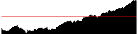
| Part of the problem with the previous graph comes
from the large range of values. |
| The bins are determined by the entire range, and about the first half of the
values fall in the first bin. |
| Although it is not widely advertised, graphs of
long-term financial
data account for this problem by plotting the logs of the closing prices, instead of the
closing prices themselves. (This is apparent if the vertical scale is shown on the
graph: the space between $10 and $100 is the same as the space between $100 and $1000.) |
| Here is a graph of the logs of the closing prices, and the IFS driven by this
sequence. |
 |
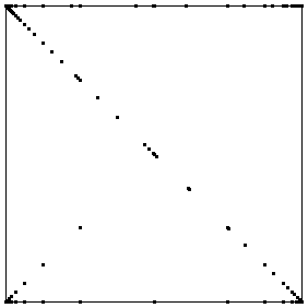 |
| Logs of closing prices | Driven IFS |
|
| This isn't a lot better. The points along the diagonal are spread
out a little more, but that is not espcially useful. |
| We see the same
backwards Z as in closing price graph. |
| The main interpretation of this
graph is that changes occur within a bin or between adjacent bins. |