Driven IFS and Financial Cartoons

Sample

Cartoon Data

How can we compare these driven IFS?

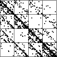
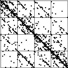
Both have a strong diagonal trend, many points lying along the line from (1, 0) to (0, 1) that reflect many consecutive points landing in bin 2 and bin 3, in all combinations.
Both have a reasonably strong subdiagonal trend, points along the line from (1/2, 0) to (0, 1/2), that reflect sometimes points landing in bin 2 or bin 3 are followed by a point landing in bin 1.
Note in both the data and the cartoon IFS, these points landing in bin 1 are rarely followed by another in bin 1, because the line from (1/4, 0) to (0, 1/4) has few points.
Also, both have a visible, but less strong, superdiagonal trend, points along the line from (1, 1/2) to (1/2, 1), that reflect sometimes points landing in bin 2 or bin 3 are followed by a point landing in bin 4.

Looking more deeply, the squares 31 and 21 have visible diagonals (more so in the cartoon than in the data).
These result from following IFS points in the subdiagonal by points in bin 3 and bin 2.
The diagonal in square 14 is empty (in the data, and contains one point in the cartoon); points would land in this diagonal if IFS points on the superdiagonal were followed by points in bin 1.

Similar comments can be made about the diagonals in the squares 43 and 24.
Note the data IFS square 41 does have some diagonal entries, while the corresponding cartoon diagonal has fewer.
This despite the (1/2, 0) to (0, 1/2) diagonal in the cartoon contains more points than in the data driven IFS.

To be sure, there are differences between the driven IFS.
Compare the squares with addresss 111, 144, and 241, for example.
However, the similarities between these driven IFS point to many combinatorial similarities between the data and this cartoon, given their respective bin boundaries.
Looking at the difference plots and focusing just on how the points lie with respect to the bin boundaries, these similarities become apparent.

Return to Sample