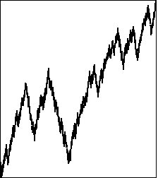
| On the left we see the 8th iterate sampled at 3128 equal
time steps. |
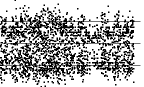
| On the right is the graph of successive differences. |
|
| Finally we see the graphs of
price vs clock time differences
and price vs trading time differences, plotted
on the same scale. |
| Note the conversion to trading time has removed the
large outliers of the difference graph in clock time. |
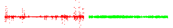 |
| This conversion to trading time has an interesting interpretation. |
| The price vs trading time difference plot
has none of the large jumps we see in the
price vs clock time difference plot. |
| In fact, the price vs trading time difference plot looks much more like a
fractional Brownian motion difference plot. |
| The conversion from price vs clock time to price vs trading time absorbs the large
jumps into the (multifractal) time conversion graph, and makes more visible
the dependence structure. |